Part V: Basic Data Visualization
Creating simple plots using plot(), hist(), pie(),barplot(),boxplot()
In R, the plot() function is a generic function used for making a variety of graphs. At its simplest, it is used to create scatter plots but can be customized to create line plots, add model lines, and much more.
Basic Arguments:
-
x: The coordinates of points in the plot. For a simple scatter plot, this is typically a numeric vector. -
y: The coordinates of points in the plot on the y-axis. Should be the same length as x. -
type: What type of plot should be drawn. Possible types include “p” for points (the default), “l” for lines, “b” for both, and several others. -
main: The main title of the plot. -
xlab: The label for the x-axis. -
ylab: The label for the y-axis. -
xlim: Limits for the x-axis. -
ylim: Limits for the y-axis. -
pch: Plotting character, or symbol to use in the plot. Different numbers correspond to different symbols. -
col: Color for the points. Can also be a vector to color points differently based on a factor.
Additional Customizations:
-
cex: A numerical value giving the amount by which plotting text and symbols should be magnified relative to the default. -
lwd: Line width for the plot, useful when the plot type includes lines. -
bg: Background color for the open plot symbols specified by pch. Advanced Features: -
abline: A function to add straight lines to a plot, either vertical, horizontal, or regression lines. -
lines: A function to add lines to a plot, in the context of the existing plot; it doesn’t start a new plot. points: Add points to a plot.
Adding a Legend:
To add a legend, you use the legend() function. It provides a number of arguments to customize its appearance:
legend: A vector of text values or an expression describing the text to appear in the legend.
x, y or position: The location of the legend. x and y can be numeric positions, or you can use keyword positions like "topright", "bottomleft", "bottomright" , "bottom", "bottomleft", "left", "topleft", "top", "right", "center".
pch: The plotting symbols for points appearing in the legend, matching those in the plot.
col: The colors for points or lines appearing in the legend, matching those in the plot.
lwd: The line widths for lines appearing in the legend, matching those in the plot.
cex: Character expansion size for the legend, determining how large the text in the legend should be.
Example 1 : Simple scatter plot
x <- 1:10
y <- rnorm(10)
plot(x, y, main = "Simple Scatter Plot", xlab = "X Axis", ylab = "Y Axis", col = "blue")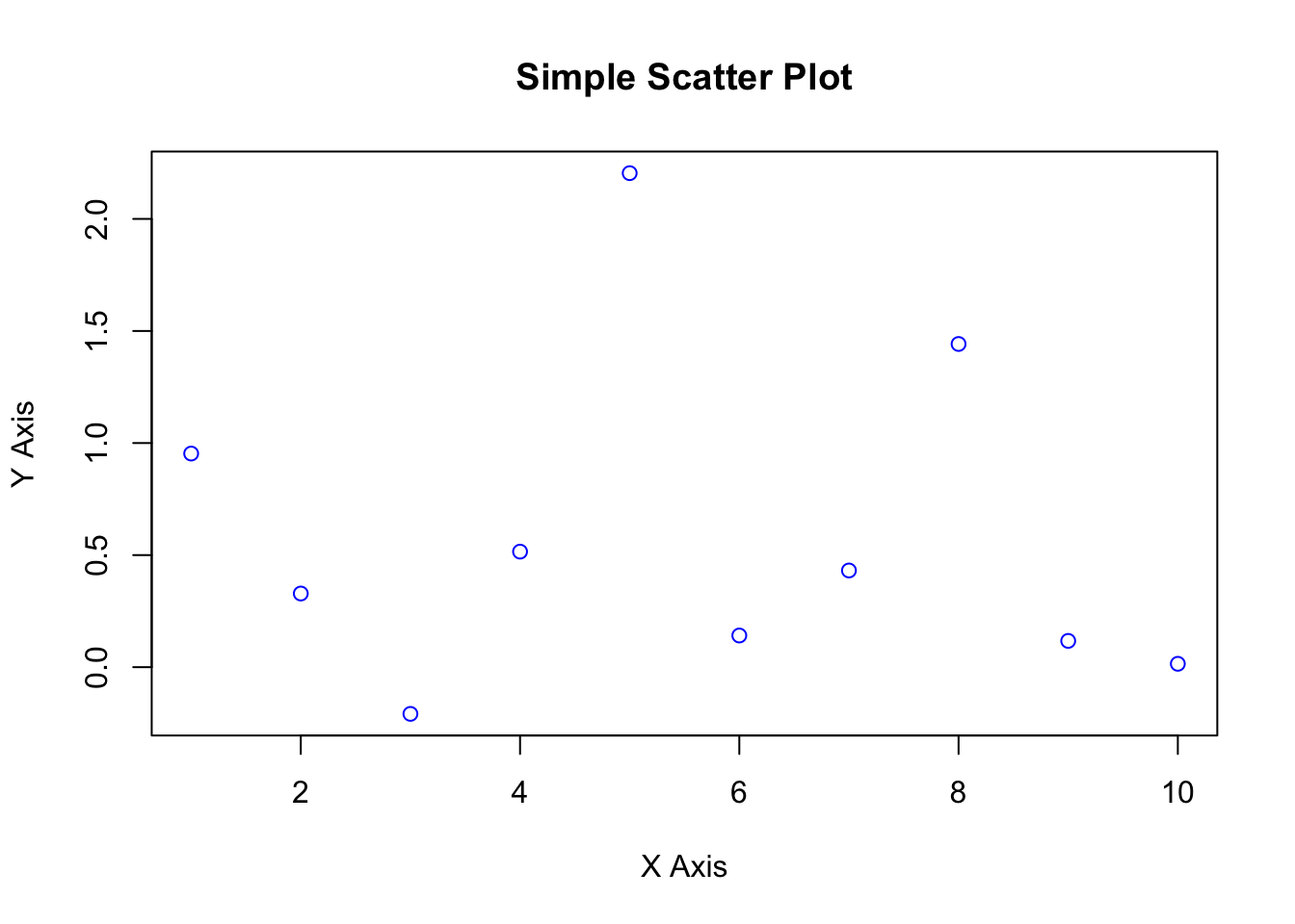
Exercise 1
Making a Scatter plot:
- load the journals.txt data set and save as Journals data frame
- Work through the following instructions
plot(log(Journals$subs), log(Journals$price))
rug(log(Journals$subs))
rug(log(Journals$price), side = 2)
Now adjust the plotting instructions
plot(log(Journals$price) ~ log(Journals$subs), pch = 19,
     col = "blue", xlim = c(0, 7), ylim = c(3, 8),
     main = "Library subscriptions")
rug(log(Journals$subs))
rug(log(Journals$price), side=2)
The curve() function draws a curve corresponding to a function over the interval [from, to].
curve(dnorm, from = -5, to = 5, col = "red", lwd = 3,
      main = "Density of the standard normal distribution")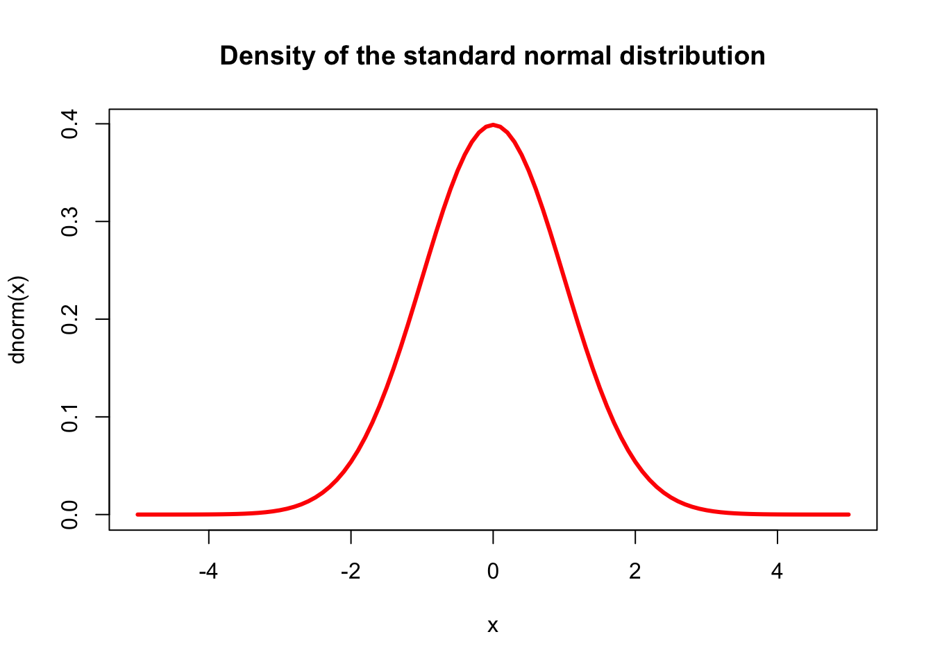
Example 2
To create a basic scatter plot, you can use the mtcars dataset, which comes built into R. This dataset contains various characteristics of 32 automobiles.
data(mtcars)


plot(mtcars$hp, mtcars$mpg, main="MPG vs. Horsepower",
     xlab="Horsepower", ylab="Miles Per Gallon",
     pch=19, col="blue")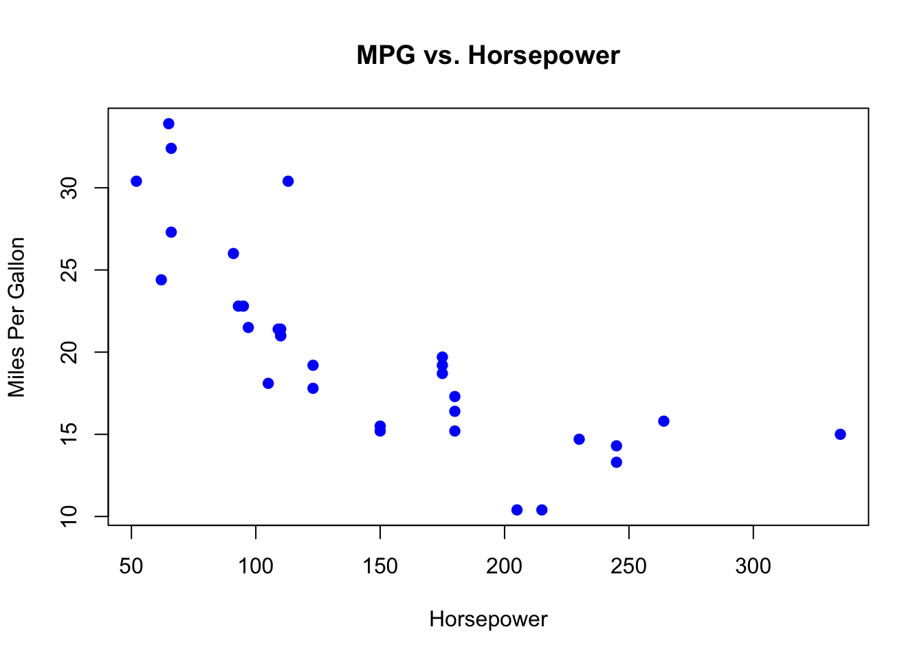
Example 3
Using the pressure dataset, which is also built into R, you can create a simple line plot. The pressure dataset shows the temperature and resulting vapor pressure of mercury.
data(pressure)

# Create a line plot
plot(pressure$temperature, pressure$pressure, type="l",
     main="Vapor Pressure of Mercury",
     xlab="Temperature", ylab="Pressure",
     col="red", lwd=2)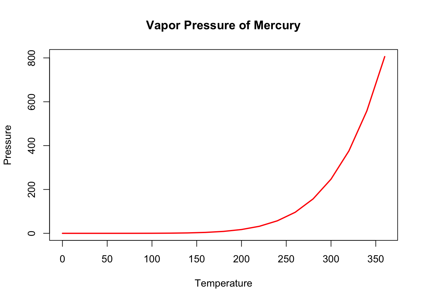
Example 4
# Load the mtcars dataset
data(mtcars)

# Plot MPG vs. Displacement, colored by Cylinders
plot(mtcars$disp, mtcars$mpg, col=as.factor(mtcars$cyl),
     main="Scatter Plot of MPG vs. Displacement",
     xlab="Displacement (cu.in.)", ylab="MPG",
     pch=19, cex=1.5)

# Add a legend to the plot
legend("topright",
       legend=paste("Cylinders:", unique(mtcars$cyl)),
       col=unique(as.numeric(as.factor(mtcars$cyl))),
       pch=19, cex=0.8)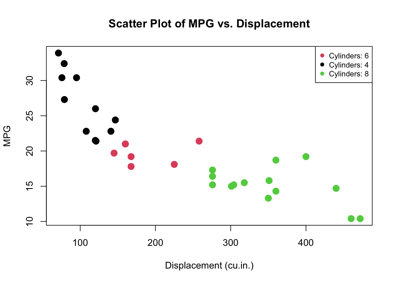
-
plot()is the generic function to create a scatter plot. mtcars\(disp and mtcars\)mpg are the x and y coordinates for the plot, representing the engine displacement in cubic inches and miles per gallon, respectively. -
col=as.factor(mtcars$cyl)specifies the colors for the points on the plot. The cyl variable, which represents the number of cylinders in the car’s engine, is converted into a factor. The levels of this factor (unique values of cyl) are automatically given different colors. -
mainis the main title for the plot. -
xlabandylabare labels for the x-axis and y-axis, respectively. -
pch=19specifies the plotting symbol (in this case, a solid circle). -
cex=1.5sets the size of the plot symbols; cex stands for character expansion factor, where 1.5 means 150% of the default size.
For the legend,
-
legend()adds a legend to the plot. -
"topright"specifies the position of the legend (in this case, at the top right corner of the plotting area). -
legend= creates the text for the legend by pasting the word “Cylinders:” in front of each unique value of the cyl column. This indicates what each color in the scatter plot corresponds to. -
col=sets the colors used in the legend, which match the colors used for the points in the plot. -
pch=19again specifies the plotting symbols used in the legend. -
cex=0.8sets the size of the symbols in the legend.
Example 5
Scatterplot()
The most common high level function used to produce plots in R is (rather unsurprisingly) the plot() function. For example, let’s plot the weight of petunia plants from our flowers data frame from flower.xls
Use the library readxl, and read_excel() function.
Alternatively , you can also use flower.txt and use read_table
library(readxl)
flowers <- read_excel('./John Jay Workshop Data/flower.xls')

plot(flowers$weight)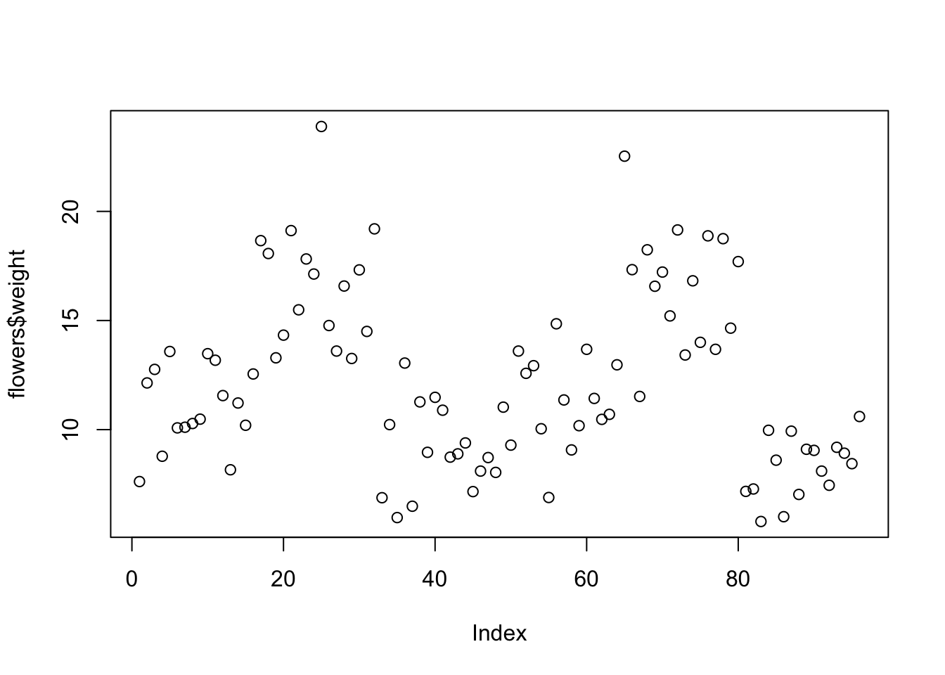
flowers <- read.table(file = './John Jay Workshop Data/flower.txt',
                        header = TRUE, sep = "\t",
                        stringsAsFactors = TRUE)
To plot a scatterplot of one numeric variable against another numeric variable we just need to include both variables as arguments when using the plot() function. For example to plot shootarea on the y axis and weight of the x axis.
plot(x = flowers$weight, y = flowers$shootarea)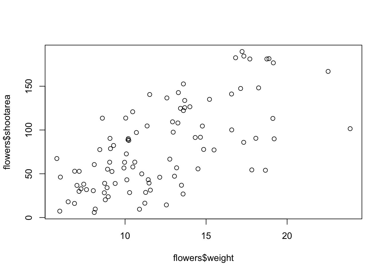
There is an equivalent approach for these types of plots which often causes some confusion at first. You can also use the formula notation when using the plot() function. However, in contrast to the previous method the formula method requires you to specify the y axis variable first, then a ~and then our x axis variable.
plot(flowers$shootarea ~ flowers$weight)
Histogram
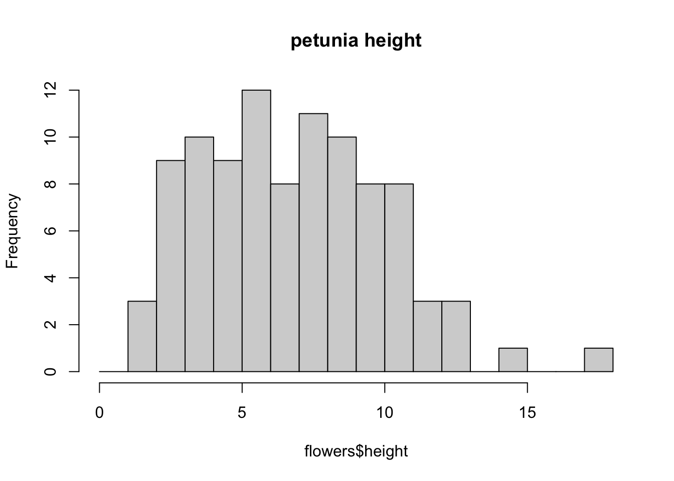
hist(flowers$height)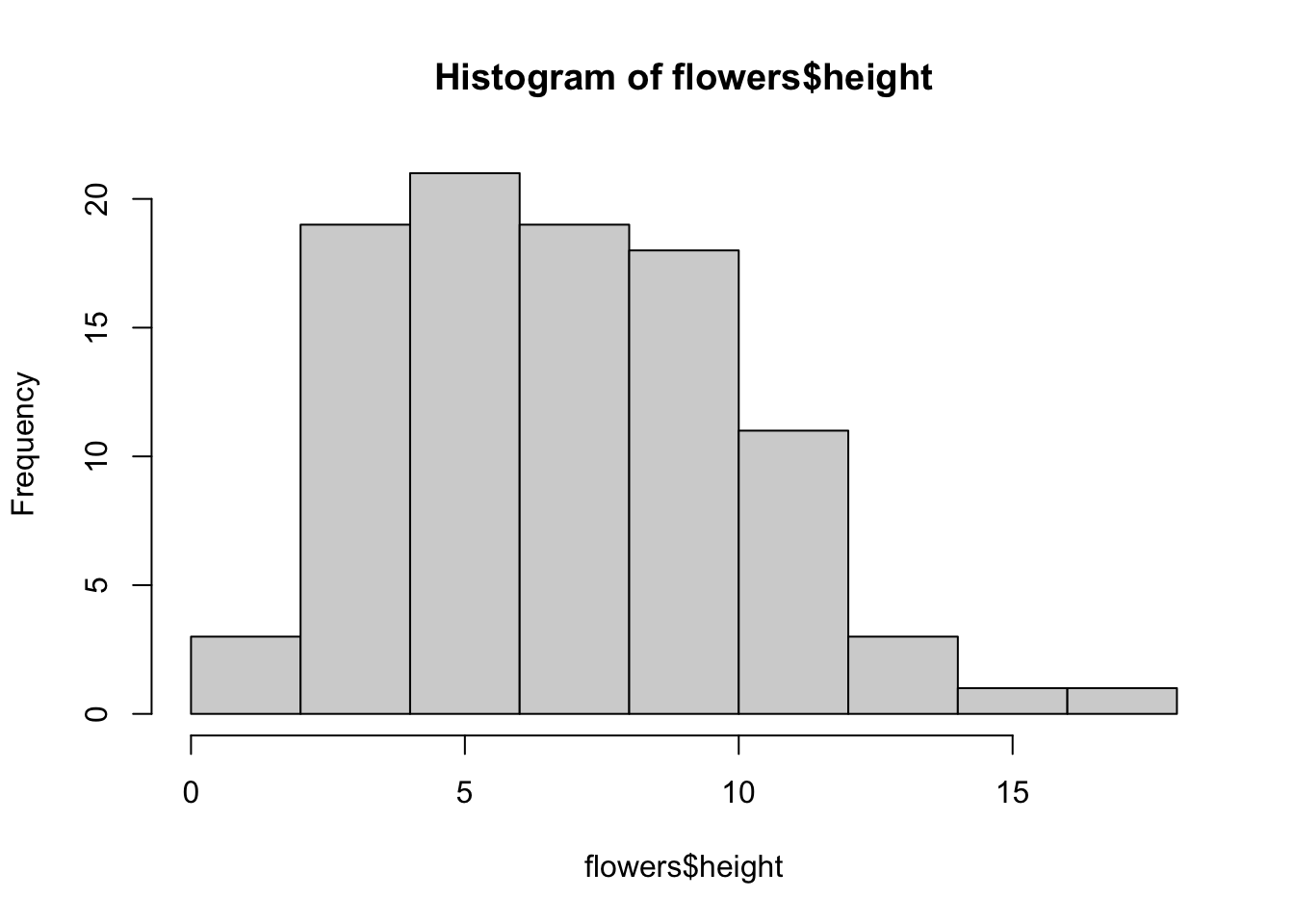
You can also display the histogram as a proportion rather than a frequency by using the freq = FALSE argument.
brk <- seq(from = 0, to = 18, by = 1)
hist(flowers$height, breaks = brk, main = "petunia height",
      freq = FALSE)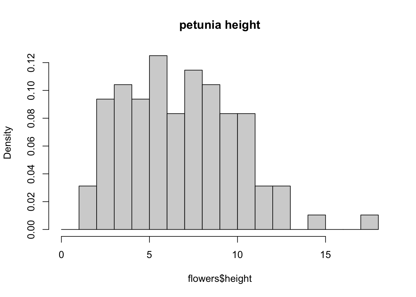
An alternative to plotting just a straight up histogram is to add a kernel density curve to the plot. You can superimpose a density curve onto the histogram by first using the density() function to compute the kernel density estimates and then use the low level function lines() to add these estimates onto the plot as a line.
dens <- density(flowers$height)
hist(flowers$height, breaks = brk, main = "petunia height",
      freq = FALSE)
lines(dens)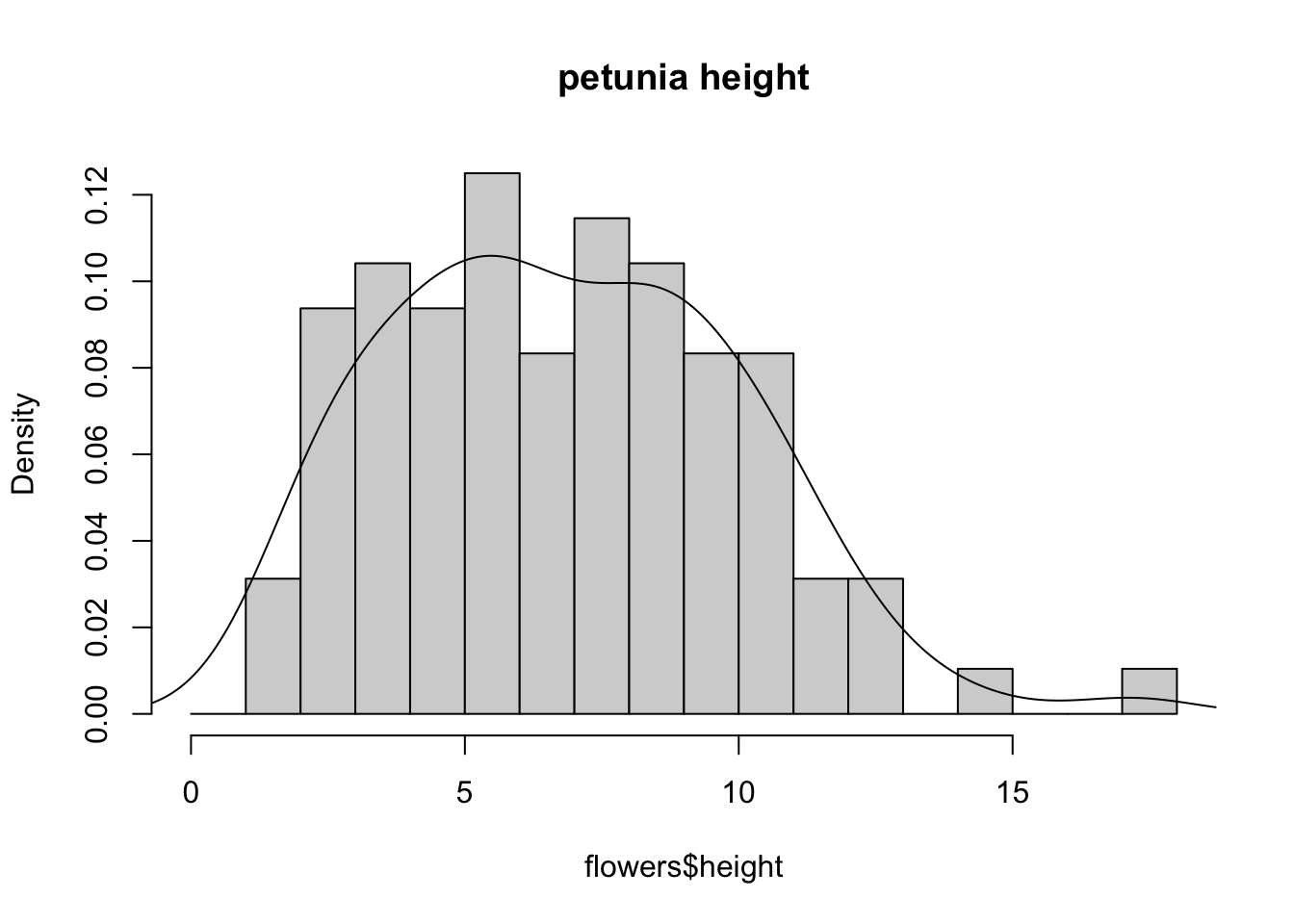
Boxplot
OK, we’ll just come and out and say it, we love boxplots and their close relation the violin plot. Boxplots (or box-and-whisker plots to give them their full name) are very useful when you want to graphically summarise the distribution of a variable, identify potential unusual values and compare distributions between different groups. The reason we love them is their ease of interpretation, transparency and relatively high data-to-ink ratio (i.e. they convey lots of information efficiently). We suggest that you try to use boxplots as much as possible when exploring your data and avoid the temptation to use the more ubiquitous bar plot (even with standard error or 95% confidence intervals bars). The problem with bar plots (aka dynamite plots) is that they hide important information from the reader such as the distribution of the data and assume that the error bars (or confidence intervals) are symmetric around the mean. Of course, it’s up to you what you do but if you’re tempted to use bar plots just Google ‘dynamite plots are evil’ see here or here
To create a boxplot in R we use the boxplot() function. For example, let’s create a boxplot of the variable weight from our flowers data frame. We can also include a y axis label using the ylab = argument.
boxplot(flowers$weight, ylab = "weight (g)")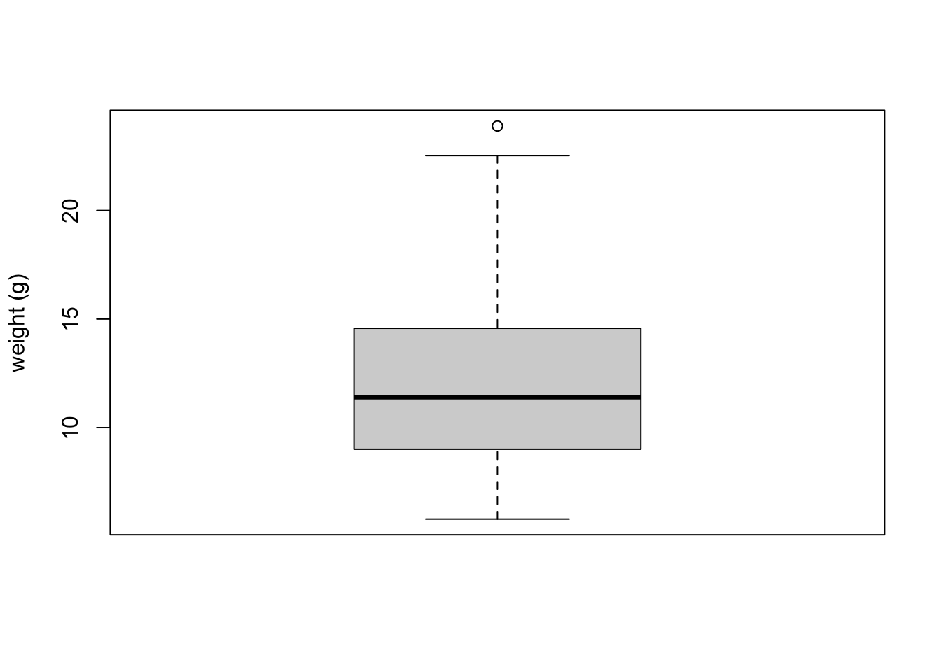 The thick horizontal line in the middle of the box is the median value of weight (around 11 g). The upper line of the box is the upper quartile (75th percentile) and the lower line is the lower quartile (25th percentile). The distance between the upper and lower quartiles is known as the inter quartile range and represents the values of weight for 50% of the data. The dotted vertical lines are called the whiskers and their length is determined as 1.5 x the inter quartile range. Data points that are plotted outside the the whiskers represent potential unusual observations. This doesn’t mean they are unusual, just that they warrant a closer look. We recommend using boxplots in combination with Cleveland dotplots to identify potential unusual observations (see the next section of this Chapter for more details). The neat thing about boxplots is that they not only provide a measure of central tendency (the median value) they also give you an idea about the distribution of the data. If the median line is more or less in the middle of the box (between the upper and lower quartiles) and the whiskers are more or less the same length then you can be reasonably sure the distribution of your data is symmetrical.
If we want examine how the distribution of a variable changes between different levels of a factor we need to use the formula notation with the boxplot() function. For example, let’s plot our weight variable again, but this time see how this changes with each level of nitrogen. When we use the formula notation with boxplot() we can use the data = argument to save some typing. We’ll also introduce an x axis label using the xlab = argument.
boxplot(weight ~ nitrogen, data = flowers,
         ylab = "weight (g)", xlab = "nitrogen level")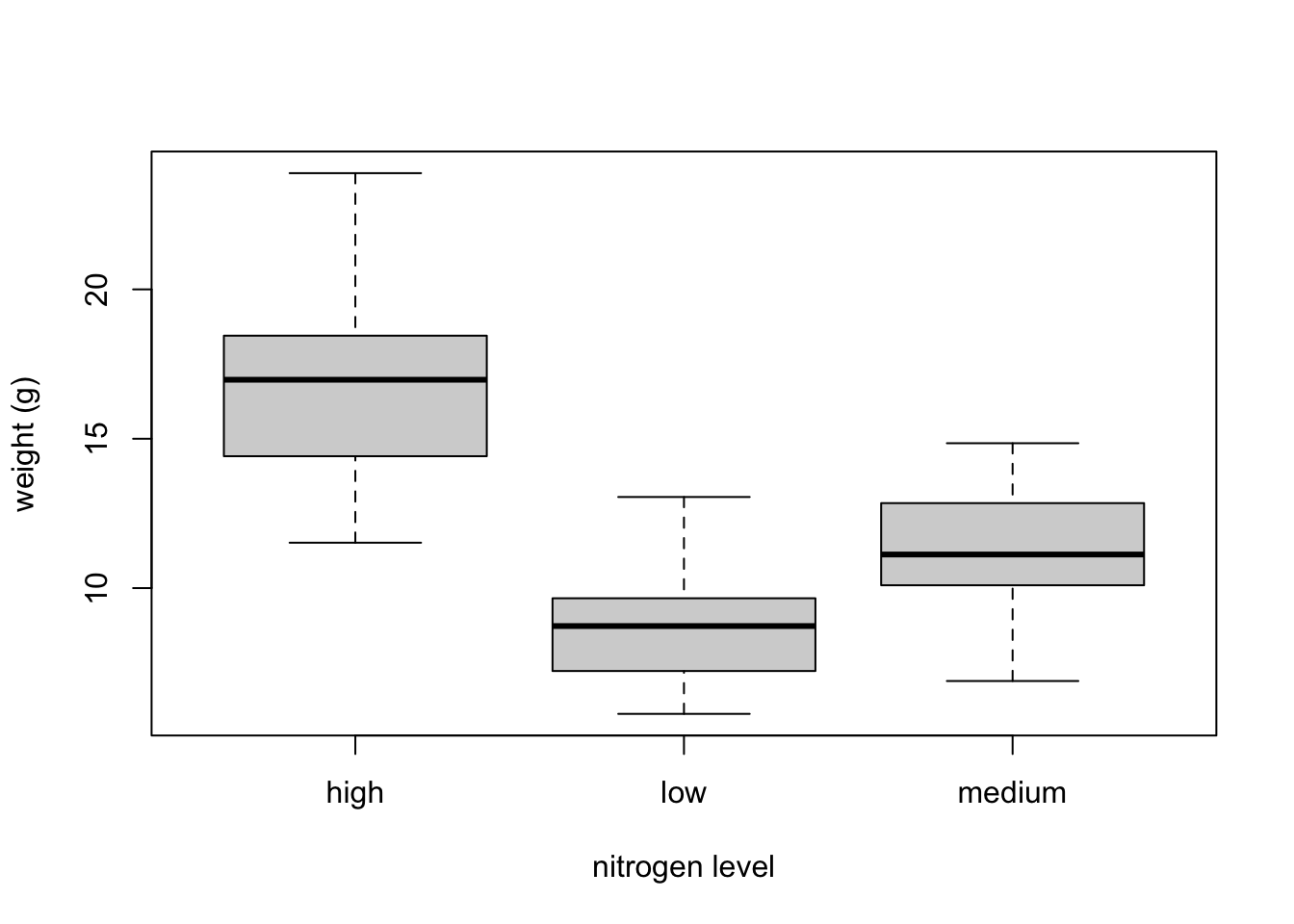
The factor levels are plotted in the same order defined by our factor variable nitrogen (often alphabetically). To change the order we need to change the order of our levels of the nitrogen factor in our data frame using the factor() function and then re-plot the graph. Let’s plot our boxplot with our factor levels going from low to high.
flowers$nitrogen <- factor(flowers$nitrogen,
                            levels = c("low", "medium", "high"))
boxplot(weight ~ nitrogen, data = flowers,
          ylab = "weight (g)", xlab = "nitrogen level")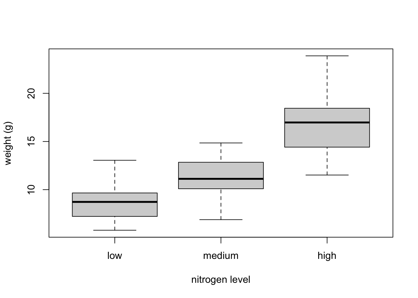
We can also group our variables by two factors in the same plot. Let’s plot our weight variable but this time plot a separate box for each nitrogen and treatment (treat) combination.
boxplot(weight ~ nitrogen * treat, data = flowers,
         ylab = "weight (g)", xlab = "nitrogen level")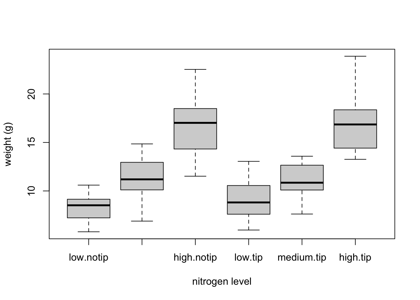
This plot looks OK, but some of the group labels are hidden as they’re too long to fit on the plot. There are a couple of ways to deal with this. Perhaps the easiest is to reduce the font size of the tick mark labels in the plot so they all fit using the cex.axis = argument. Let’s set the font size to be 30% smaller than the default with cex.axis = 0.7
boxplot(weight ~ nitrogen * treat, data = flowers,
ylab = "weight (g)", xlab = "nitrogen level",
cex.axis = 0.7)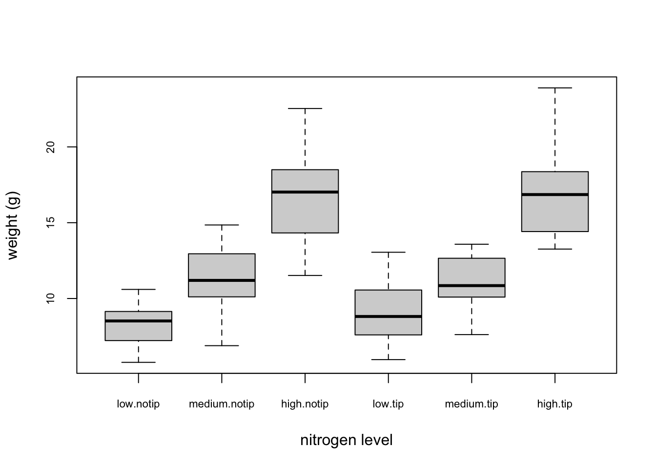 ## Violin Plots {-}
Violin plots are like a combination of a boxplot and a kernel density plot (you saw an example of a kernel density plot in the histogram section above) all rolled into one figure. We can create a violin plot in R using the vioplot() function from the vioplot package. You’ll need to first install this package using install.packages(‘vioplot’) function as usual. The nice thing about the vioplot() function is that you use it in pretty much the same way you would use the boxplot() function. We’ll also use the argument col = “lightblue” to change the fill colour to light blue.
#install.packages("vioplot")
library(vioplot)
#> Loading required package: sm
#> Package 'sm', version 2.2-6.0: type help(sm) for summary information
#> Loading required package: zoo
#>
#> Attaching package: 'zoo'
#> The following objects are masked from 'package:base':
#>
#>     as.Date, as.Date.numeric
vioplot(weight ~ nitrogen, data = flowers,
         ylab = "weight (g)", xlab = "nitrogen level",
         col = "lightblue")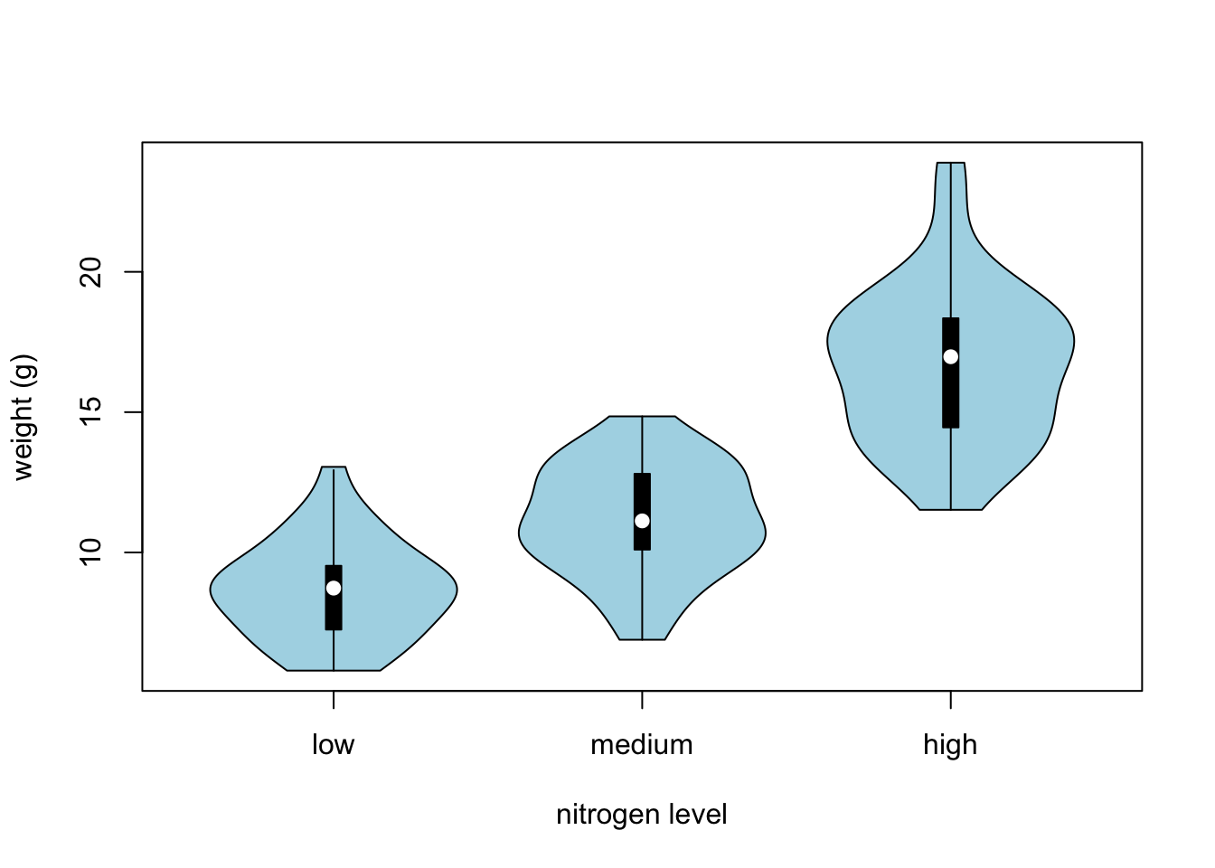
Exercise 2
Now, try creating your own visualization using the iris dataset. Here’s what you can do:
- Create a scatter plot using Petal.Length and Petal.Width from the iris dataset.
- Color the points based on the Species column to differentiate between the species.
- Add a title, x-axis label, and y-axis label to your plot. Include a legend that indicates which color corresponds to which iris species.