Part I: Advanced Data Visualization
The aim of the ggplot2 package is to create elegant data visualizations using the grammar of graphics.
Here are the basic steps:
- begin a plot with the function
ggplot()creating a coordinate system that you can add layers to
-the first argument of ggplot() is the dataset to use in the graph
We will use the mpg dataset from ggplot2
library(ggplot2)
head(mpg)
#> # A tibble: 6 × 11
#>   manufacturer model displ  year   cyl trans     drv     cty
#>   <chr>        <chr> <dbl> <int> <int> <chr>     <chr> <int>
#> 1 audi         a4      1.8  1999     4 auto(l5)  f        18
#> 2 audi         a4      1.8  1999     4 manual(m… f        21
#> 3 audi         a4      2    2008     4 manual(m… f        20
#> 4 audi         a4      2    2008     4 auto(av)  f        21
#> 5 audi         a4      2.8  1999     6 auto(l5)  f        16
#> 6 audi         a4      2.8  1999     6 manual(m… f        18
#> # ℹ 3 more variables: hwy <int>, fl <chr>, class <chr>
Run the following code,
What do you obtain ?
ggplot(data = mpg)
ggplot(mpg) You create an empty graph.
You complete the graph by adding one or more layers to ggplot()
for example: - geom_point() adds a layer of points to your plot, which creates a scatterplot - geom_smooth() adds a smooth line - geom_bar a bar plot.
Each geom function in ggplot2 takes a mapping argument:
- how variables in your dataset are mapped to visual properties
- always paired with aes() and the and arguments of aes() specify which variables to map to the and axes.
library(ggplot2)
ggplot(data = mpg) +
  geom_point(mapping = aes(x = displ, y = hwy))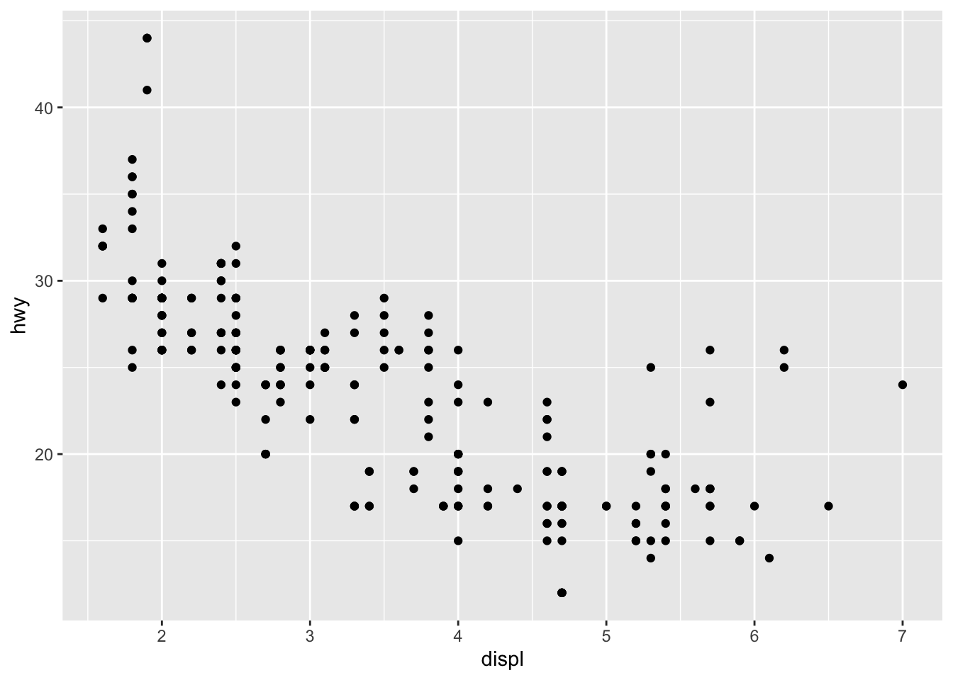
ggplot(data = mpg) + geom_point(aes(x = displ, y = hwy, color = class))
Compare the following set of instructions:
- inside of aesthetics
ggplot(mpg) + geom_point(aes(x = displ, y = hwy, color = class))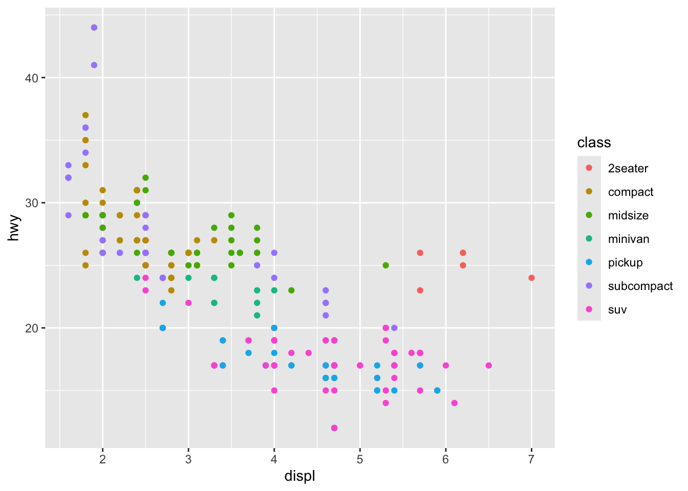
- inside of aesthetics, not mapped to a variable
ggplot(mpg) + geom_point(aes(x = displ, y = hwy, color = "blue"))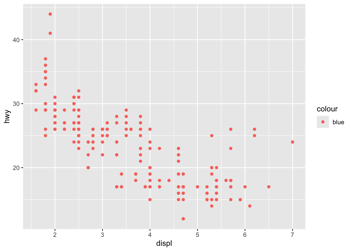
- outside of aesthetics
ggplot(mpg) + geom_point(aes(x = displ, y = hwy), color = "blue")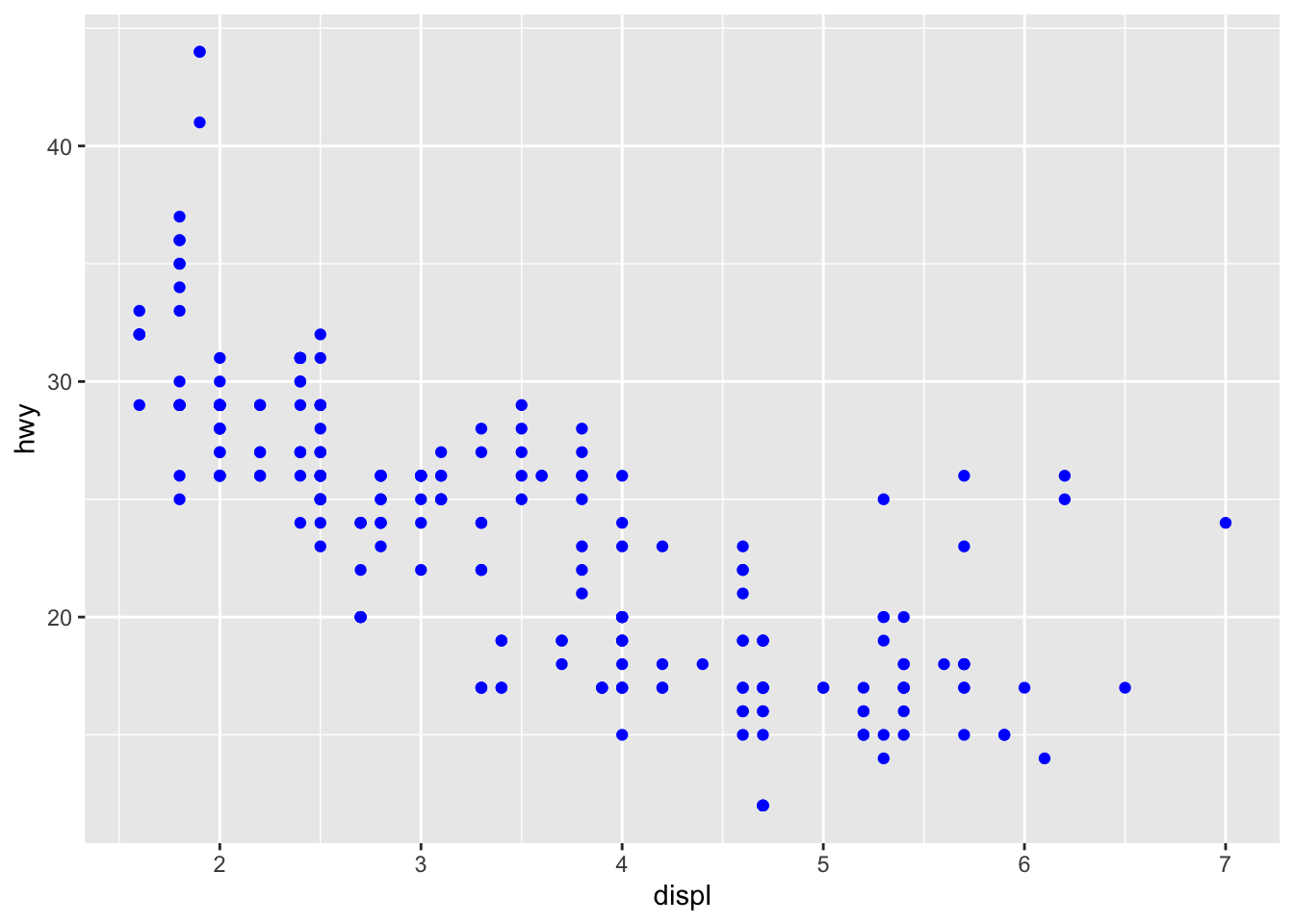
- Scatterplot
ggplot(mpg) +
  geom_point(mapping = aes(x = class, y = hwy))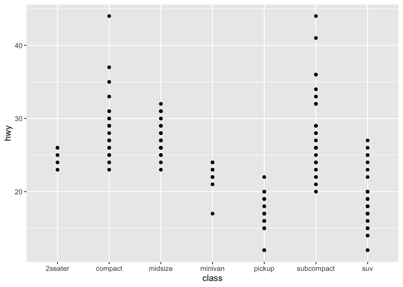
- boxplot
ggplot(data = mpg) +
  geom_boxplot(mapping = aes(x = class, y = hwy))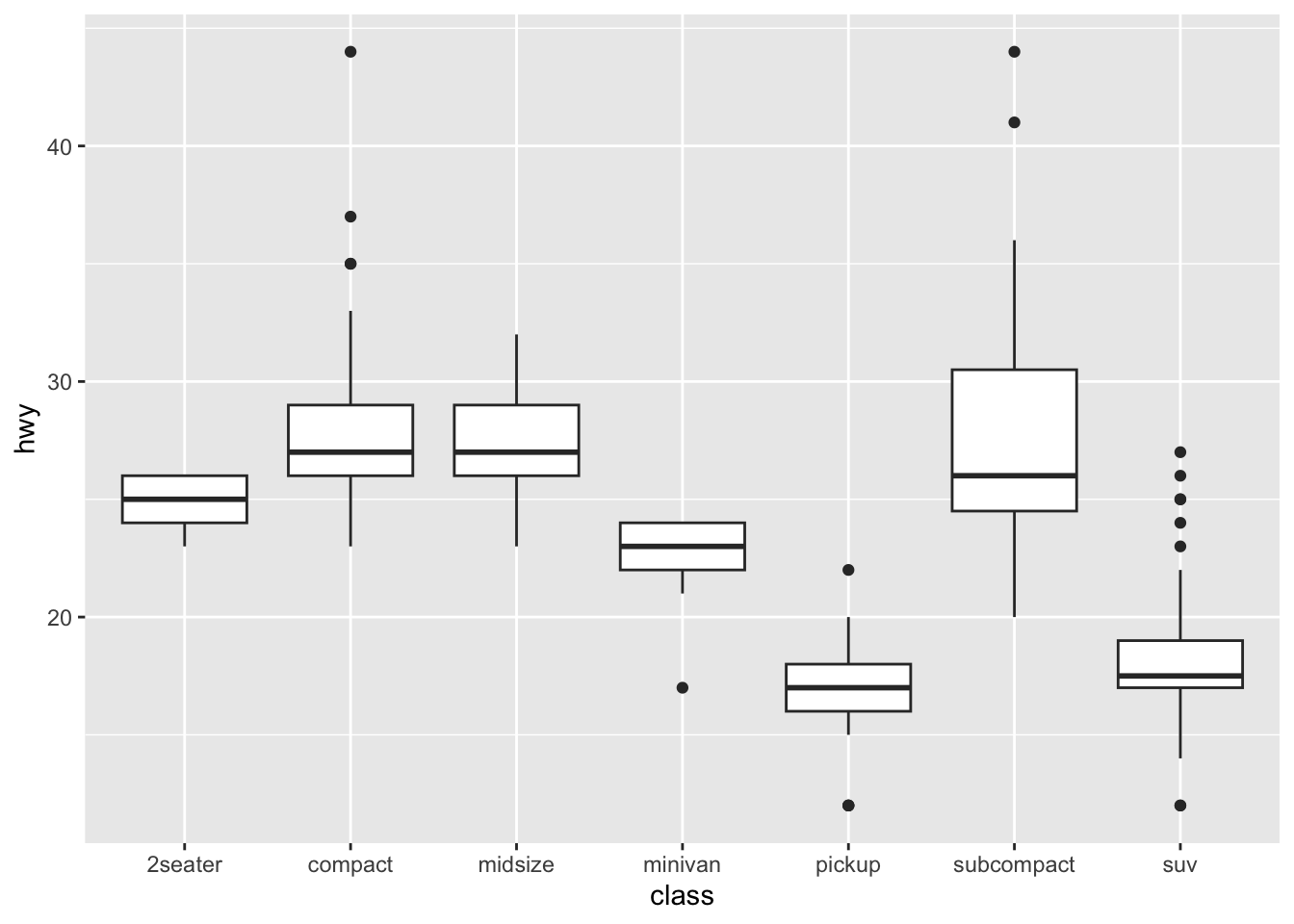
- histogram
ggplot(data = mpg) +
  geom_histogram(mapping = aes(x = hwy))
#> `stat_bin()` using `bins = 30`. Pick better value with
#> `binwidth`.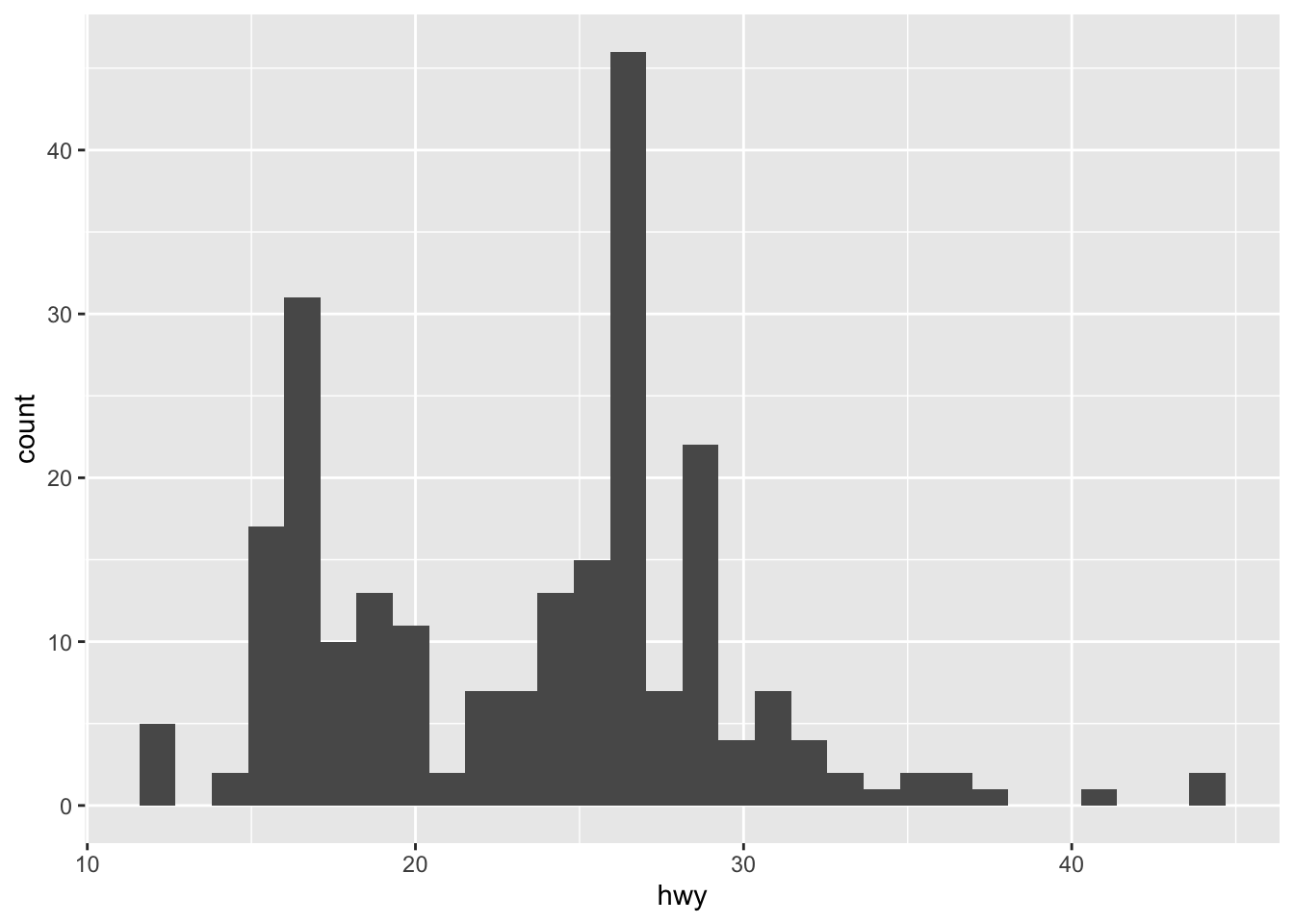
ggplot(data = mpg) +
  geom_density(mapping = aes(x = hwy))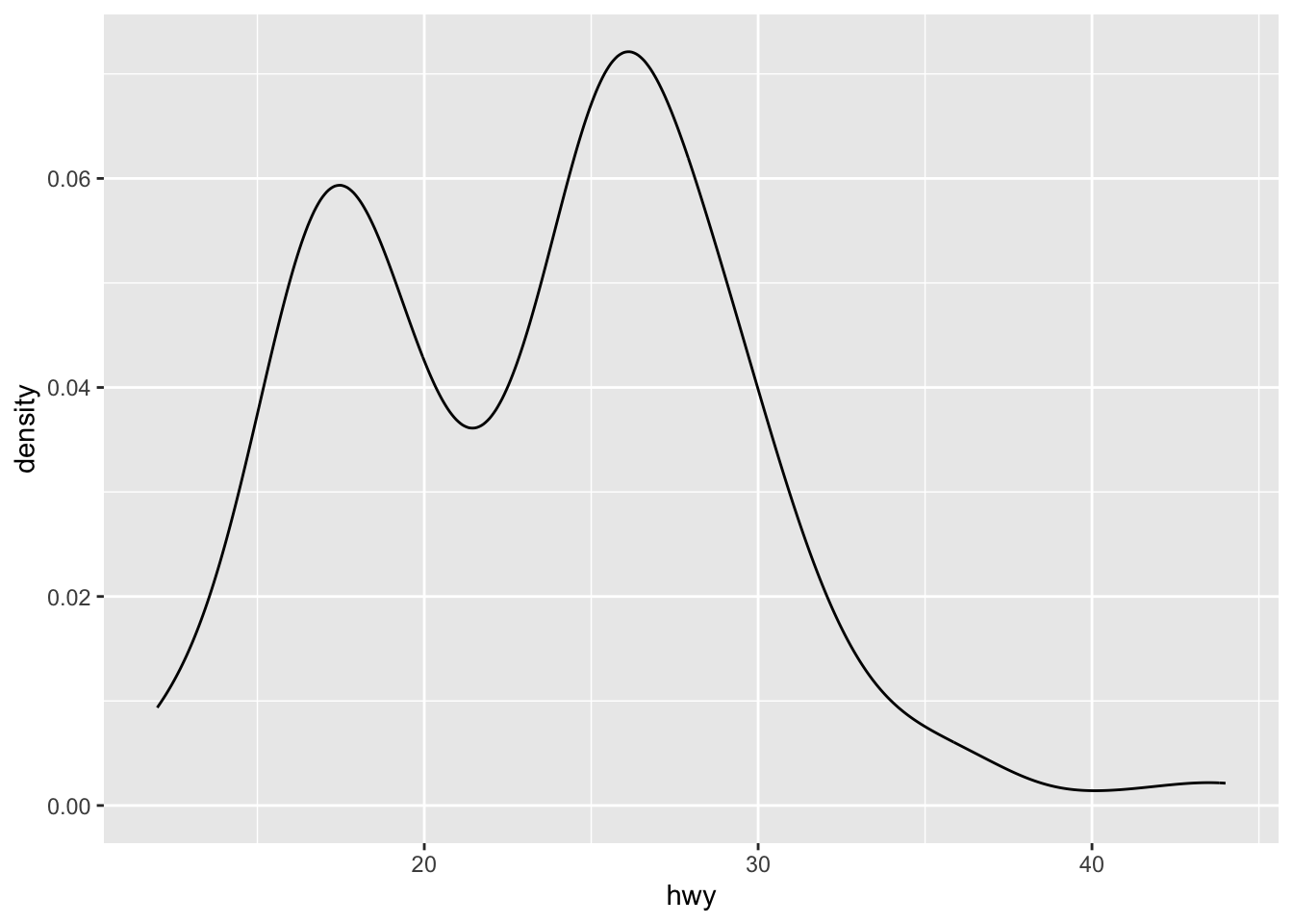
Now you will add multiple geoms to the same plot. Predict what the following code does:
ggplot(data = mpg) +
  geom_point(mapping = aes(x = displ, y = hwy)) +
  geom_smooth(mapping = aes(x = displ, y = hwy))
#> `geom_smooth()` using method = 'loess' and formula = 'y ~
#> x'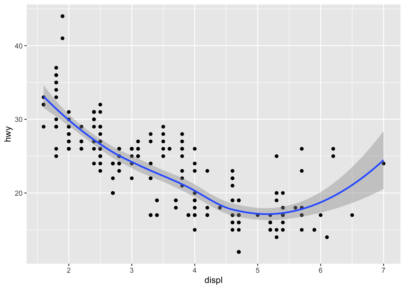
Mappings and data can be specified global (in ggplot()) or local.
ggplot(data = mpg, mapping = aes(x = displ, y = hwy)) +
  geom_point() +
  geom_smooth() + theme_bw()       # adjust theme
#> `geom_smooth()` using method = 'loess' and formula = 'y ~
#> x'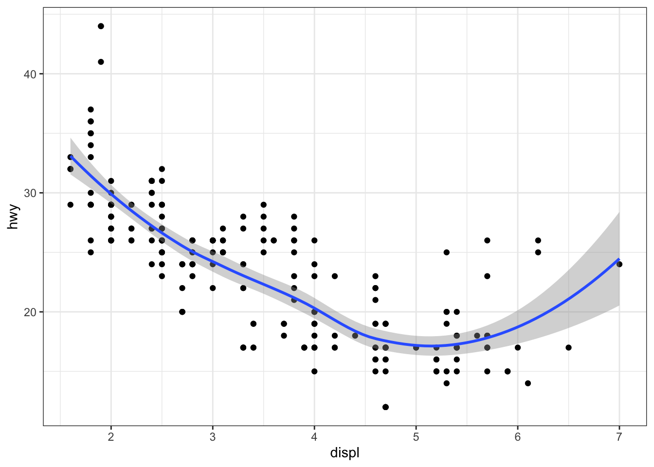
local.
ggplot(data = mpg, mapping = aes(x = displ, y = hwy)) +
  geom_point(mapping = aes(color = drv)) +
  geom_smooth() + theme_bw()
#> `geom_smooth()` using method = 'loess' and formula = 'y ~
#> x'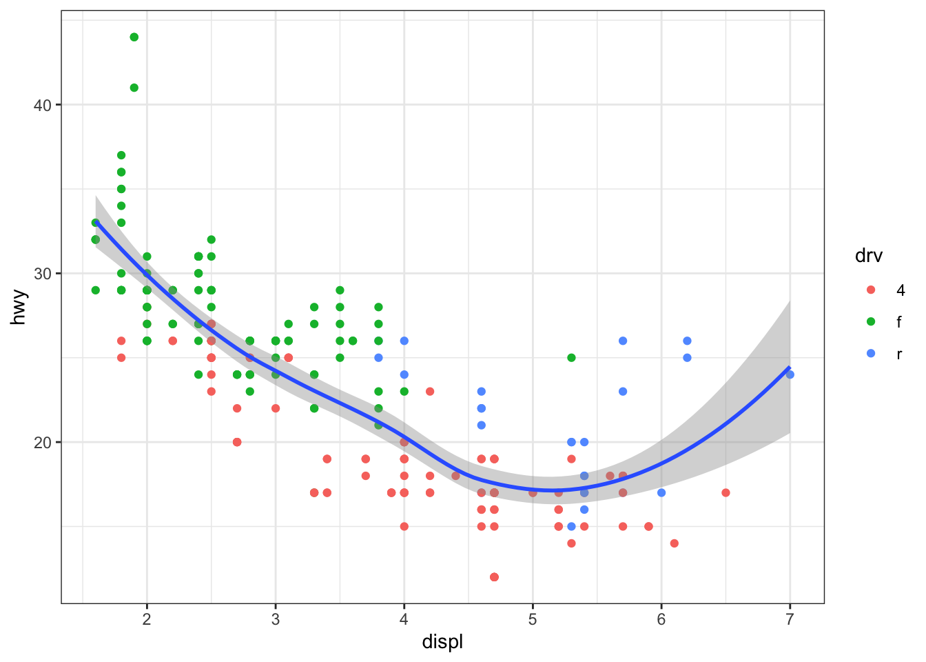
library(dplyr)
#>
#> Attaching package: 'dplyr'
#> The following objects are masked from 'package:stats':
#>
#>     filter, lag
#> The following objects are masked from 'package:base':
#>
#>     intersect, setdiff, setequal, union
ggplot(data = mpg, mapping = aes(x = displ, y = hwy)) +
  geom_point(mapping = aes(color = drv)) +
  geom_smooth(data = filter(mpg, drv == "f")) + theme_bw()
#> `geom_smooth()` using method = 'loess' and formula = 'y ~
#> x'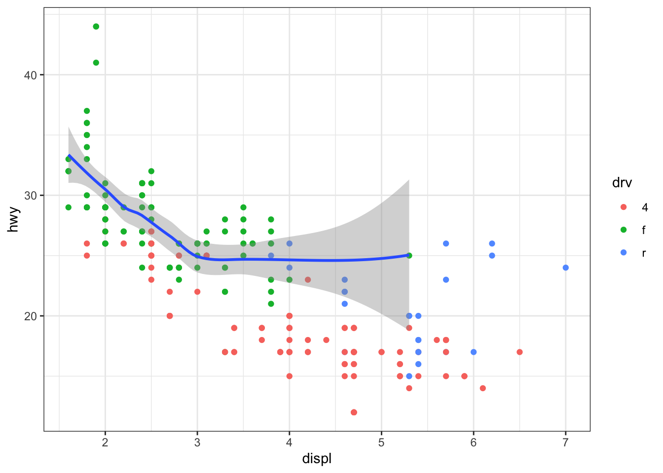
Exercise 1
Use the Danish fire insurance losses. Plot the arrival of losses over time.
- Use type= “l” for a line plot, label the and -axis, and give the plot a title using main.
- Do the same with instructions from ggplot2. Use geom_line() to create the line plot.
Exercise 2
Use the data set car_price.csv available in the documentation. Import the data in R.
Explore the data.
Make a scatterplot of price versus income, use basic plotting instructions and use ggplot2.
Add a smooth line to each of the plots (using lines to add a line to an existing plot and lowess to do scatterplot smoothing and using geom_smooth in the ggplot2 grammar).
Creating customized plots with ggplot2
# Load ggplot2 package
library(ggplot2)

# Example: Customized scatter plot with ggplot2
data <- data.frame(x = rnorm(100), y = rnorm(100))
ggplot(data, aes(x = x, y = y)) +
  geom_point(aes(color = x*y), size = 3) +
  scale_color_gradient(low = "blue", high = "red") +
  ggtitle("Customized Scatter Plot with Color Gradient") +
  theme_minimal()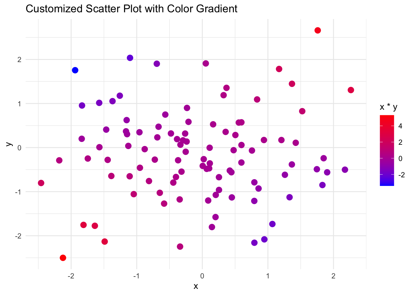
Adding titles, labels, and themes to plots
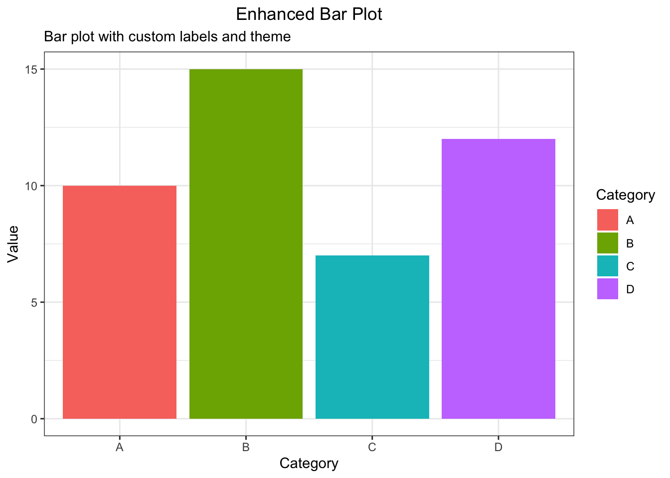
# Example: Enhanced bar plot with titles, labels, and a custom theme
data <- data.frame(
  category = c("A", "B", "C", "D"),
  value = c(10, 15, 7, 12)
)
ggplot(data, aes(x = category, y = value, fill = category)) +
  geom_bar(stat = "identity") +
  labs(title = "Enhanced Bar Plot",
       subtitle = "Bar plot with custom labels and theme",
       x = "Category",
       y = "Value",
       fill = "Category") +
  theme_bw() +
  theme(plot.title = element_text(hjust = 0.5))